Tidal Marketing
Branding and Logo design for Tidal Marketing, Google Ads Agency
Services Rendered //
Logo Design
Strategy Guides
Branding
Design System
Tidal Marketing is an agency, with Google Ad campaigns as a prime service with commission-based services. They guide clients through the complexities of e-commerce, helping them navigate the 'oceans' of online business.

Case Study
Visual identity for Tidal Marketing, Google Ads Agency
Mission
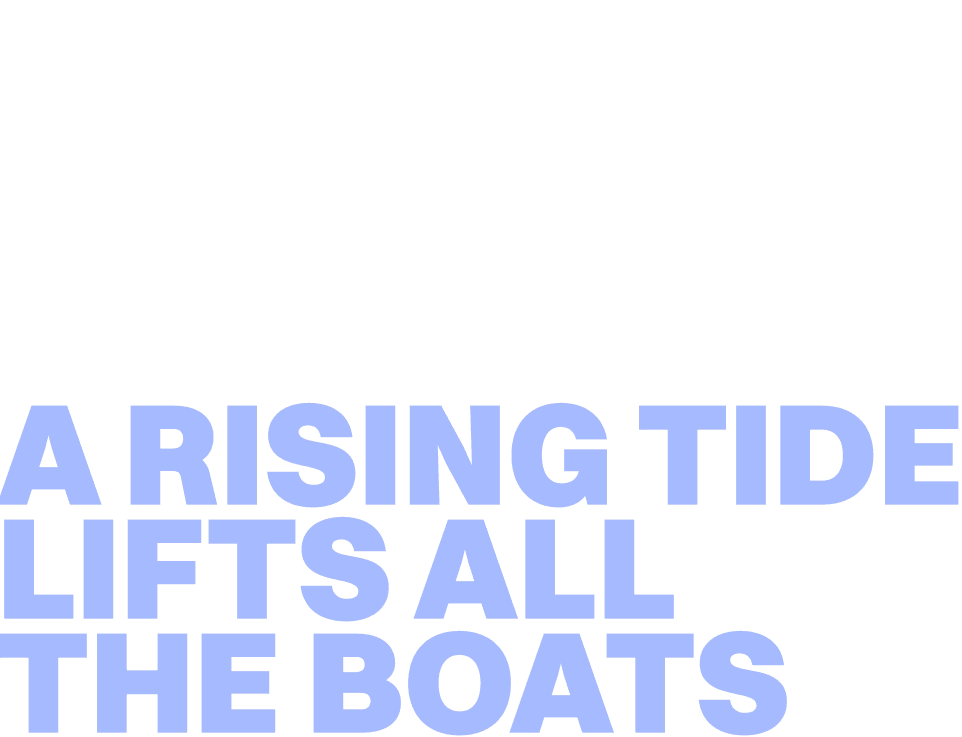
Tidal Marketing needed the Brand revamp, that is inspired by ocean tides, which are the rise and fall of water levels due to the moon's gravitational pull. The saying, "A rising tide lifts all boats," reflects their philosophy.
Requirements
We delivered a handcrafted concept that embodies the highest quality design and branding for Tidal Marketing. After a deep study and close collaboration with Tim , the founder of Tidal Marketing we achieve a perfect solution and create a timeless logo that will stand out among the concurrents.
Collaborators
Tidal Marketing - feedback and revisions
Lali Nisi - Design and project management
Exploration //
“We are an agency, with Google Ad campaigns as a prime service with commission-based services. Additional services can include managing online stores and social media campaigns for our clients. Our profit model: if our clients prosper, so do we. If they don't earn revenue from our work, neither do we.
Another layer to our brand name relates to our location in Seattle, built around Puget Sound, an inlet of the Pacific Ocean. Here, the water levels fluctuate with the tides. Additionally, the brand name Tidal Marketing shares my initials, TM, adding a personal touch.”
-Tim Minzer, Founder of Tidal Marketing


The Target //
“Our ideal client is the owner of a Handcrafted Furniture store, particularly those with online sales of at least $40k per month. Our goal is to boost their business to six-figure monthly sales using Google Ad campaigns.
We recognize a strong market demand for hand-made, solid wood furniture and aim to support these businesses in their growth. Our profit-share model minimizes risk for our partners. We guide them through the complexities of e-commerce, helping them navigate the 'oceans' of online business.”
-Tim Minzer, Founder of Tidal Marketing


Design of Tidal Marketing Logo is intentionally organic, the waves are evident and lines are smooth. Few symbols are hidden in this Logo, like the shape of the half-moon and the sail. The Letters M and T are also present, “T” is more “chunky”, and “M” is more pronounced.
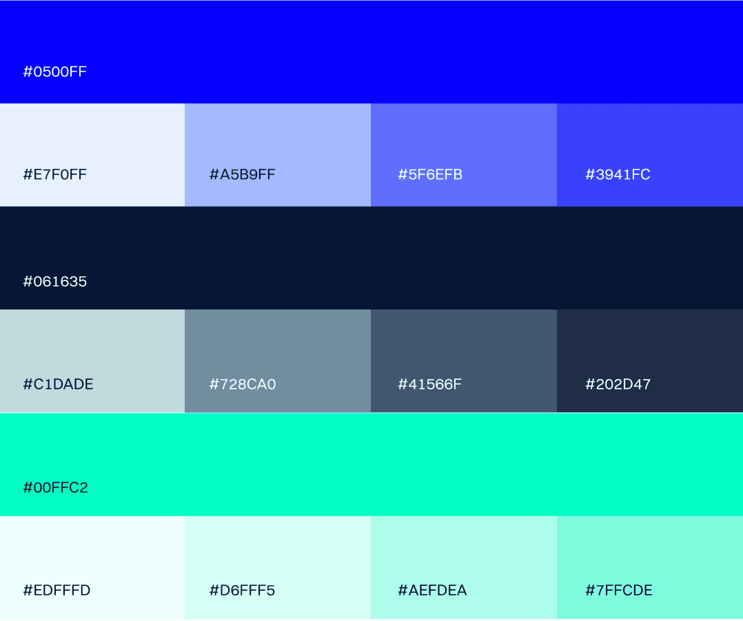
The new logo and branding have revitalized the Tidal Marketing image, creating a fresh and modern identity that resonates with their target audience. The Design System gave a solid foundation for all the aspects of this Brand, next steps will be to implement it to the Web and social spaces. We also received positive feedback from the clients of this Agency and overall credibility has grown.


